
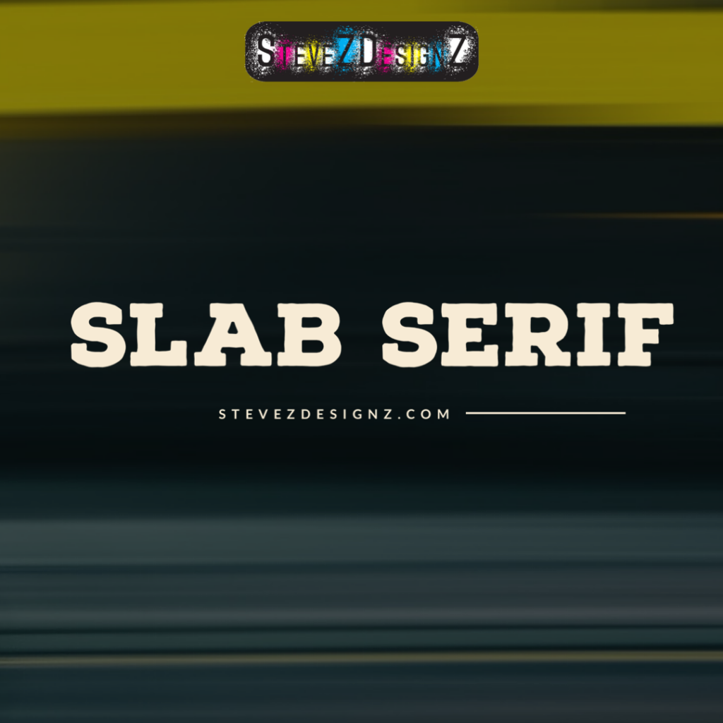
What are Slab Serif Fonts? In typography, where each font carries a unique personality, slab serif fonts stand out for their bold and commanding presence. These typefaces, characterized by their thick, square-shaped serifs, have a rich history and a versatile appeal that has stood the test of time. Let’s embark on a typographic journey to explore the origins, characteristics, and contemporary applications of slab serif fonts.
What are Slab Serif Fonts?
The word “slab” originated from the Old French word “esclab,” meaning a broken piece or fragment. It ultimately has Latin roots, coming from “lavus,” meaning nail or stud. In modern usage, “slab” typically refers to a thick, flat piece of material, such as stone or concrete.
The term “serif” describes the ornamental lines found at the ends of letter strokes in a typeface. It originates from the Dutch word “schreef,” meaning a line or stroke, and has been utilized in typography since the 19th century.
The roots of slab serif fonts can be traced back to the 19th century, a period marked by industrialization and a shift towards more robust and utilitarian design. During this time, type designers sought to create fonts that embodied strength and clarity, giving rise to the slab serif style. One of the earliest examples is the Clarendon typeface, introduced in the mid-1800s, which featured thick, unbracketed serifs and a sturdy overall structure.
Slab serif fonts are characterized by their distinct features, making them easily recognizable. The most notable element is, of course, the slab-like serifs – solid, blocky extensions at the end of each stroke. These serifs are often unbracketed, meaning they lack the tapered transitions found in traditional serifs. The letterforms themselves tend to be bold and geometric, contributing to a sense of solidity and visual impact.
One of the key strengths of slab serif fonts lies in their versatility. Whether used for print or digital media, these fonts can convey a range of moods and themes. Their bold and robust nature makes them ideal for headlines, logos, and attention-grabbing elements in design. On the other hand, when scaled down, slab serif fonts can also maintain readability in body text, providing a harmonious balance between strength and subtlety.
Several iconic slab serif typefaces have left an indelible mark on the design world. Examples include Rockwell, with its bold and geometric forms; Courier, known for its monospaced characters and typewriter aesthetic; and Memphis, a vibrant and playful slab serif that gained popularity in the 1980s.
In the digital age, slab serif fonts continue to find favor in various design contexts. From web design and branding to editorial layouts, designers appreciate the authoritative yet adaptable nature of slab serifs. The combination of tradition and modernity makes these fonts well-suited for projects that demand a timeless and impactful typographic presence.
Examples of Slab Serif Fonts
- Rockwell
- Clarendon
- Serifa
- Lubalin Graph
- Egyptienne F
- Sentinel
- Courier
- Archer
- Memphis
- Aachen
In the ever-evolving landscape of typography, slab serif fonts endure as a design classic. Their bold serifs and solid forms convey a sense of strength and stability, making them a reliable choice for a diverse range of applications. As we continue to push the boundaries of design, the distinctive charm of slab serif fonts remains a testament to the enduring power of typographic innovation.
Contact SteveZ DesignZ for your graphic design needs! Make sure you also subscribe to learn more about Graphic Design and Printing along with terms, being a designer and much more!
Follow SteveZ DesignZ on Social Media!
Subscribe To The Graphic Design Blog!
Follow SteveZ DesignZ on WordPress.comDon’t miss a blog post about graphic design. Subscribe today!
Recent Feed of All of Steve’s Blogs


1 COMMENTS